Top Flite Packaging
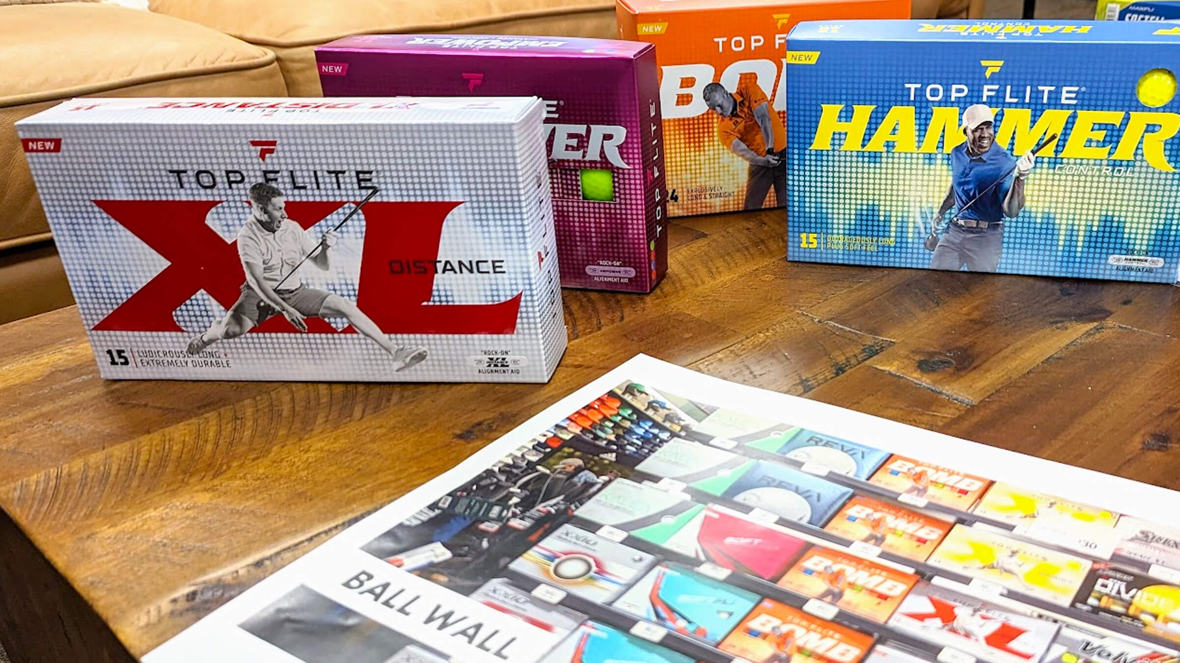
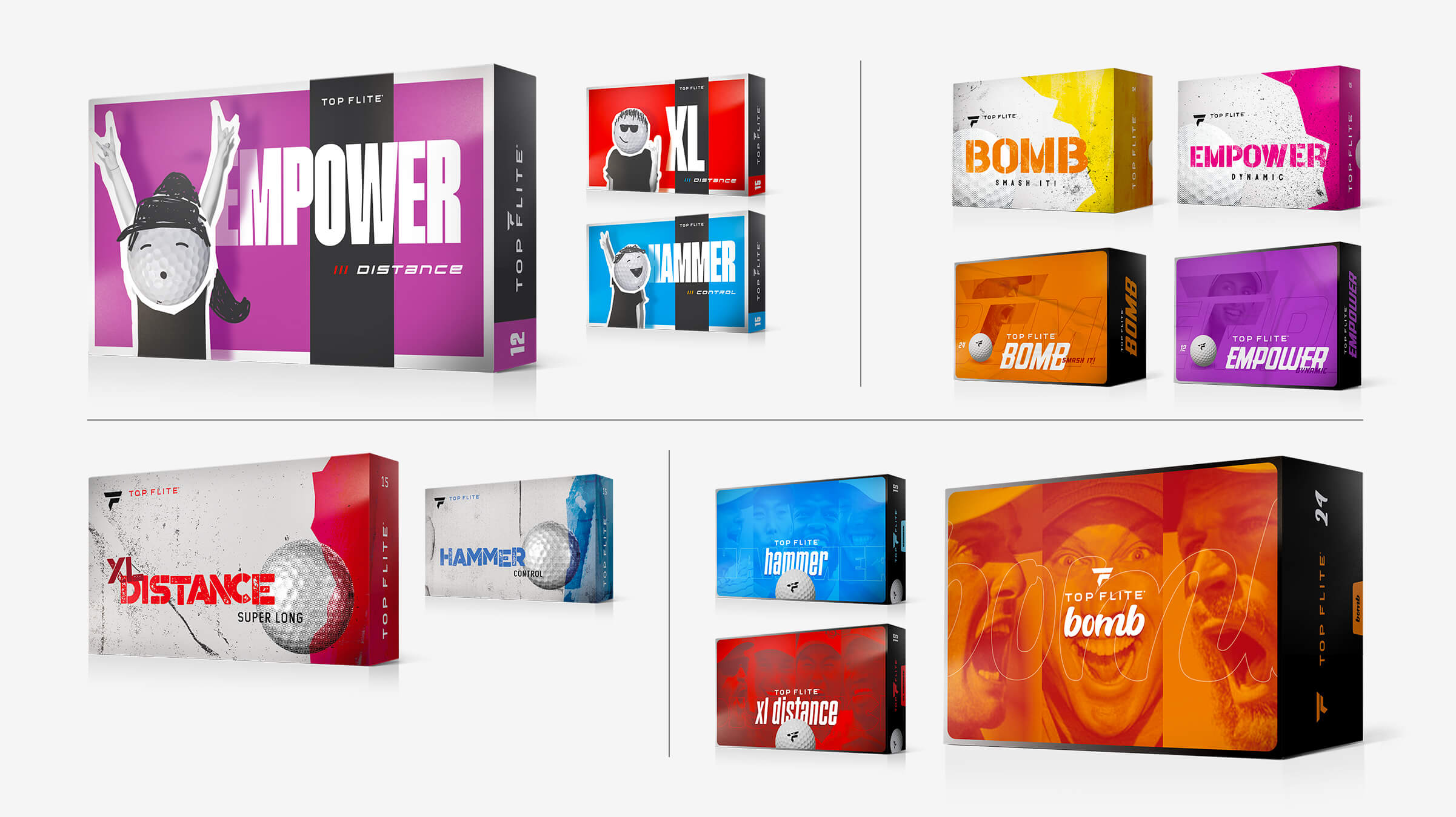
Longtime Flynn client, DICK'S Sporting Goods, was ready for an update to their golf ball packaging after a major brand overhaul of a rock and roll vibe a couple years earlier. As with most consumer packaging, designs need to continuously delight and surprise to attract and fuel loyalty.
Rockin' fun for all golfers
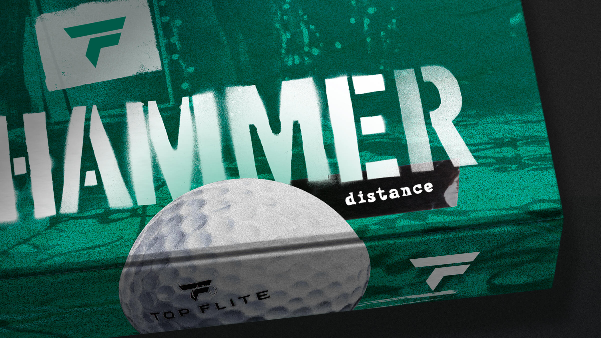
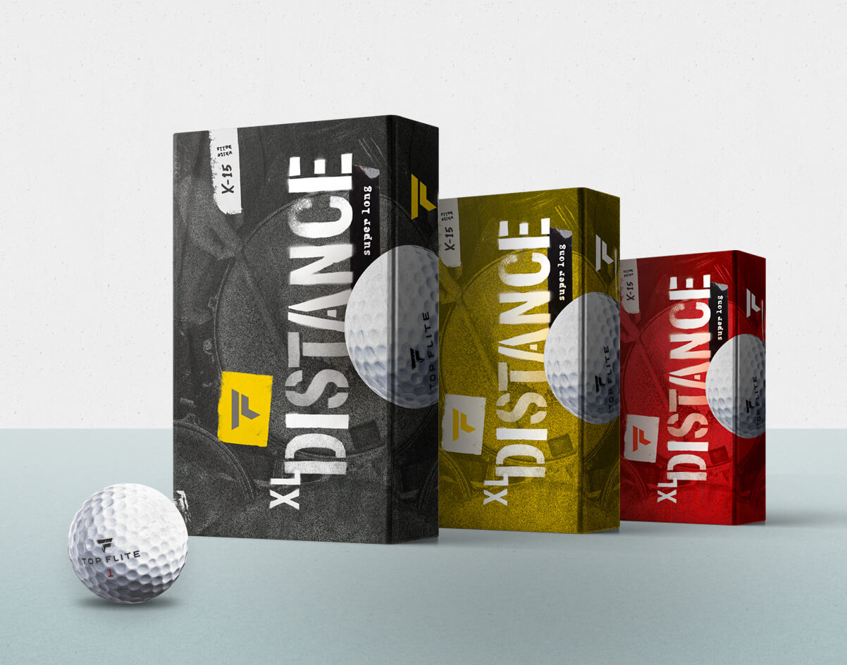
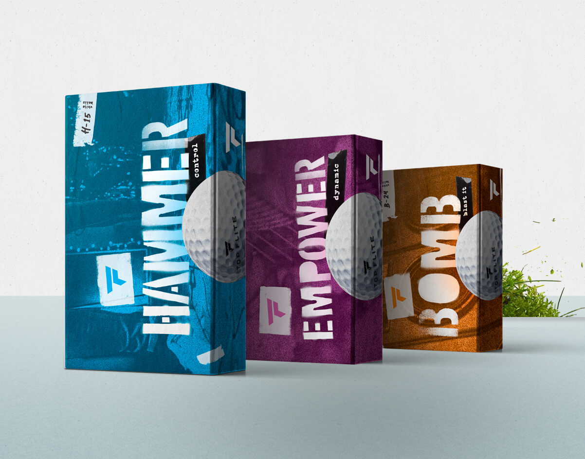
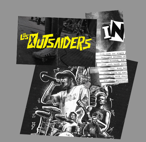
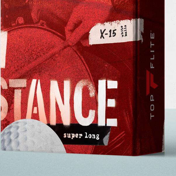
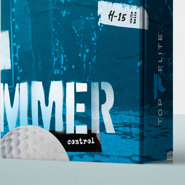
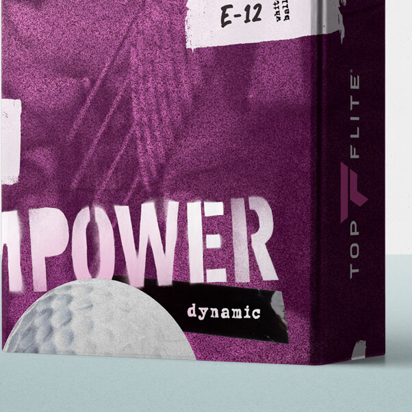
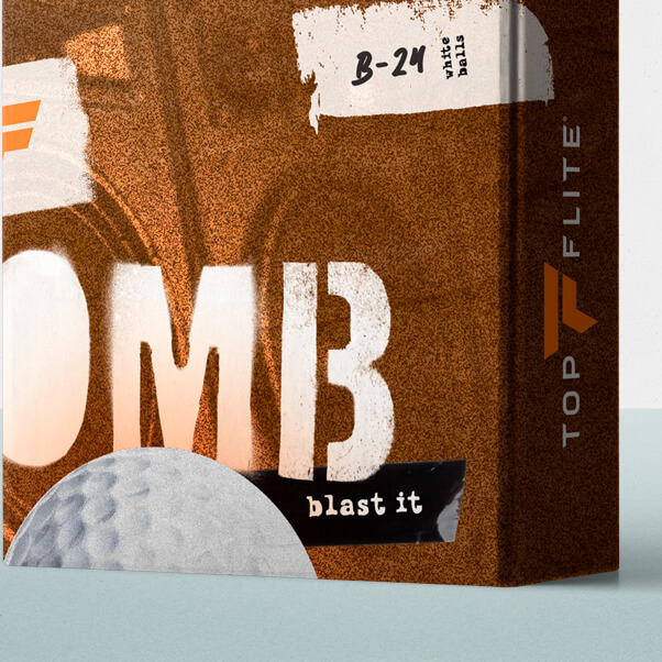
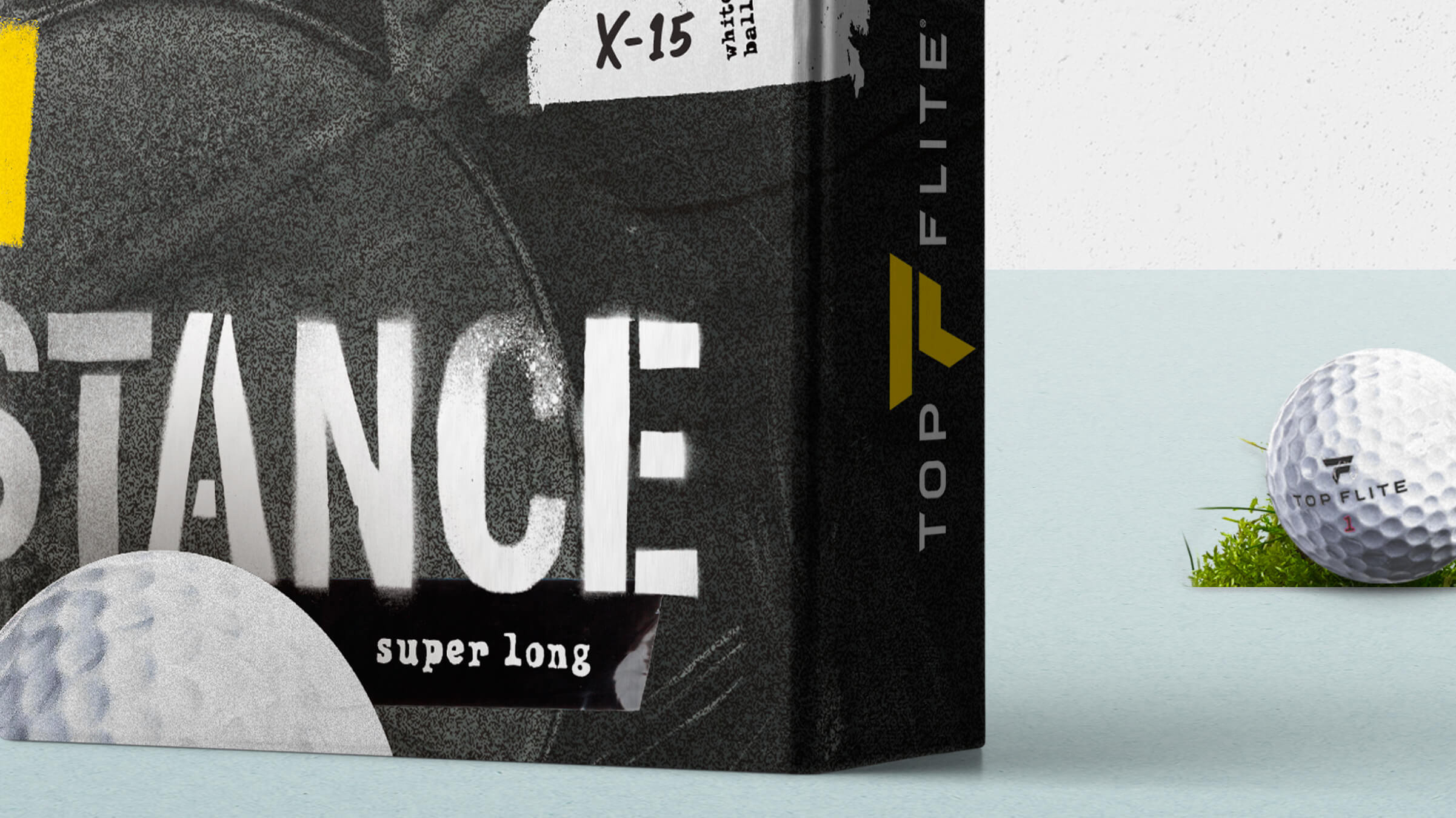
Evolving from packaging with air guitarists, we pushed into a really bold roadie vibe. On stage. Gritty. Stencils. Label tape.
Where's my ball?
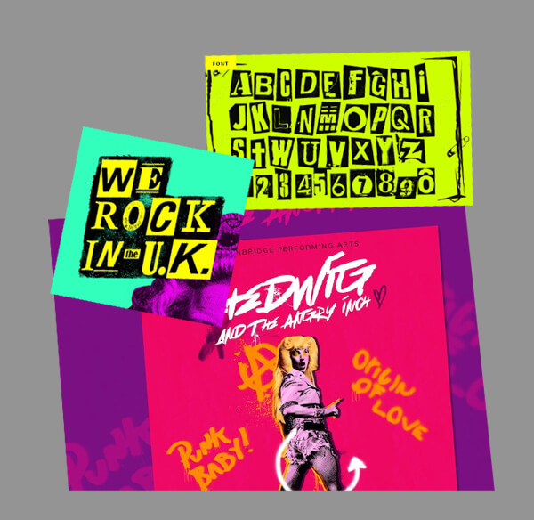
With several SKUs available, color-coding is vital. We went all-in with bold tones and huge labels.
Concept Exploration
From a place of strength, onto the next level.
In large part, there's a numbingly sea of sameness with golf ball packaging. Flynn helped Top Flite break the mold a few years ago with expressive, rock and roll golfers. The combination of bold colors and photos of golfers helped Top Flite jump out on retail 'ball walls'. The designs had performed really well, but over time, the client (and consumers) were ready for the next evolution of this fresh thinking...
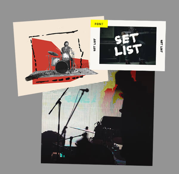
Concept Ideation: A
On-stage performance. Expressive groupies.
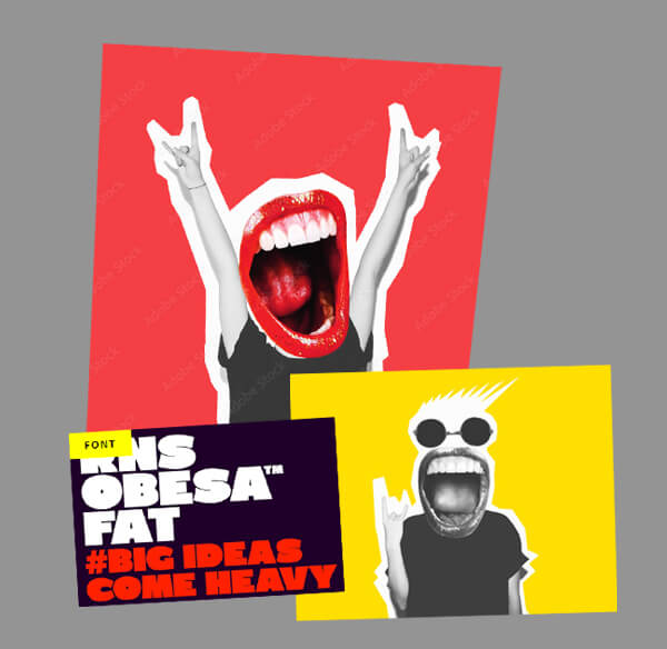
Concept Ideation: B
Gritty, aggresive punk vibes.
Client + Agency
- Client:
- DICK'S Sporting Goods
- Agency:
- Flynn
Assignment
- Store Brand Evolution
- Package Design
My Role
- Creative Director
- Designer
- Mech Artist
Our Team
- Matt D'Angelo, Creative
- Paul Hill, Creative
- Pete VonDerLinn, Strategy
- Heather Riexinger, Account