The RAF is the greater Rochester area's local chapter of the American Advertising Federation. It's a long-running ad club offering all types of inspirational and networking events. As a board member, I saw a great opportunity to update the branding and visual expressions to more clearly communicate the club's mission, offerings, and remain creatively relevant.
I knew that this pro bono undertaking would require a lot of work and coordination, but all of that effort would be wasted if we did not clearly understand the mission and get full buy-in from the start. "Members of the board, may I have your attention?"...
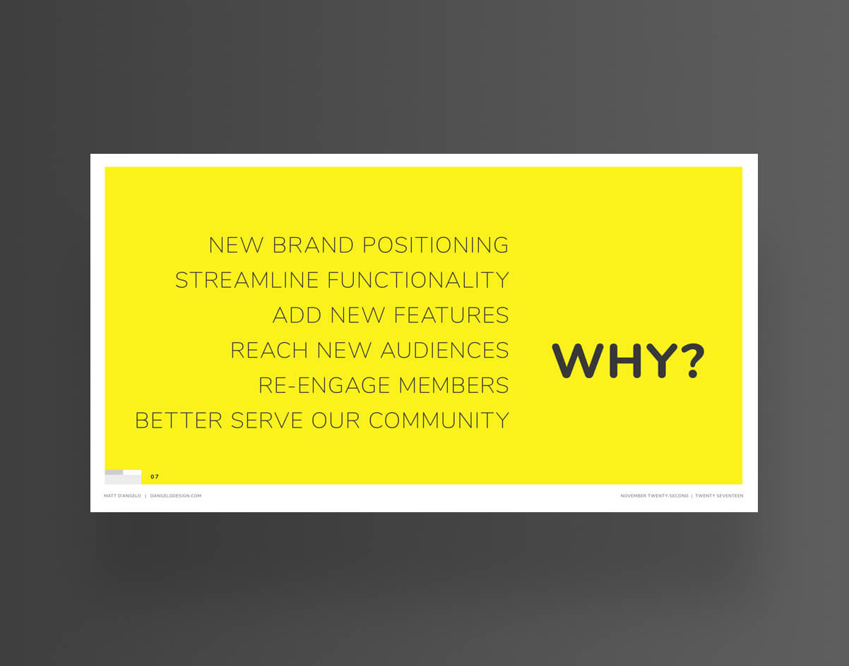
With great enthusiasm and solid logic I explained why the club needed a change and how to effectively reach our goals with a design overhaul.
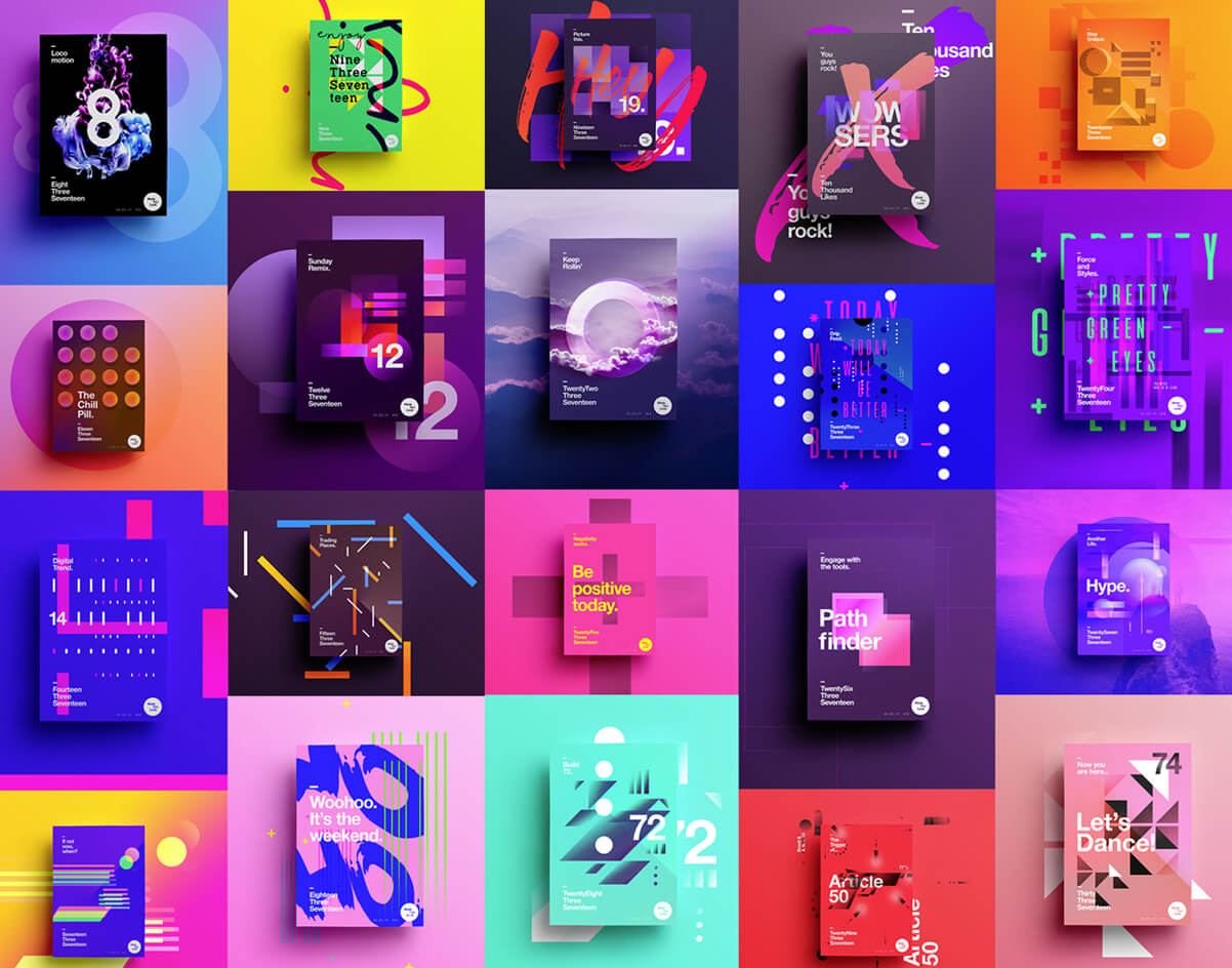
Collected a range of visual examples that could springboard design exploration into an exciting visual language rooted in academic design roots and inclusivity.
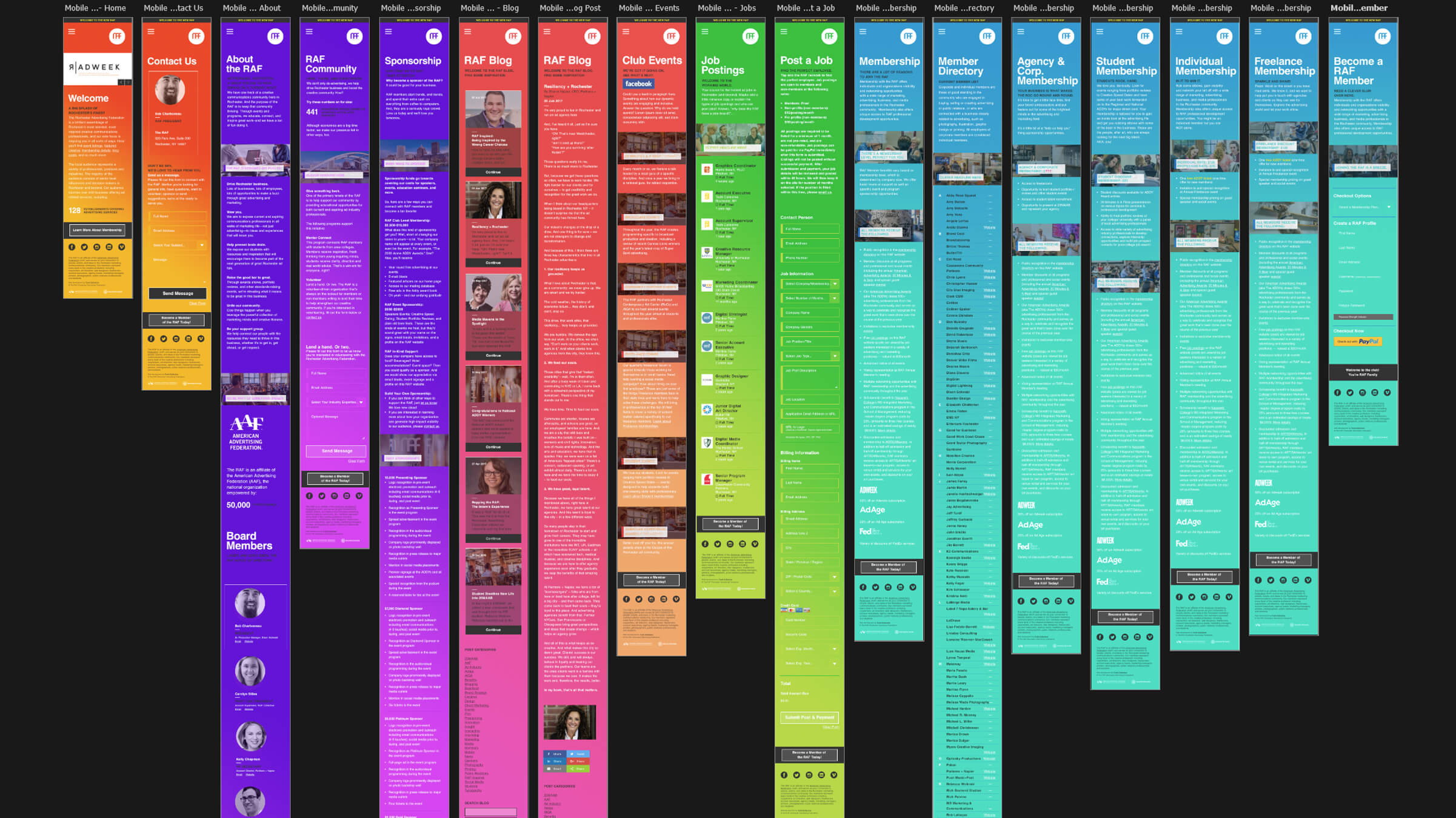
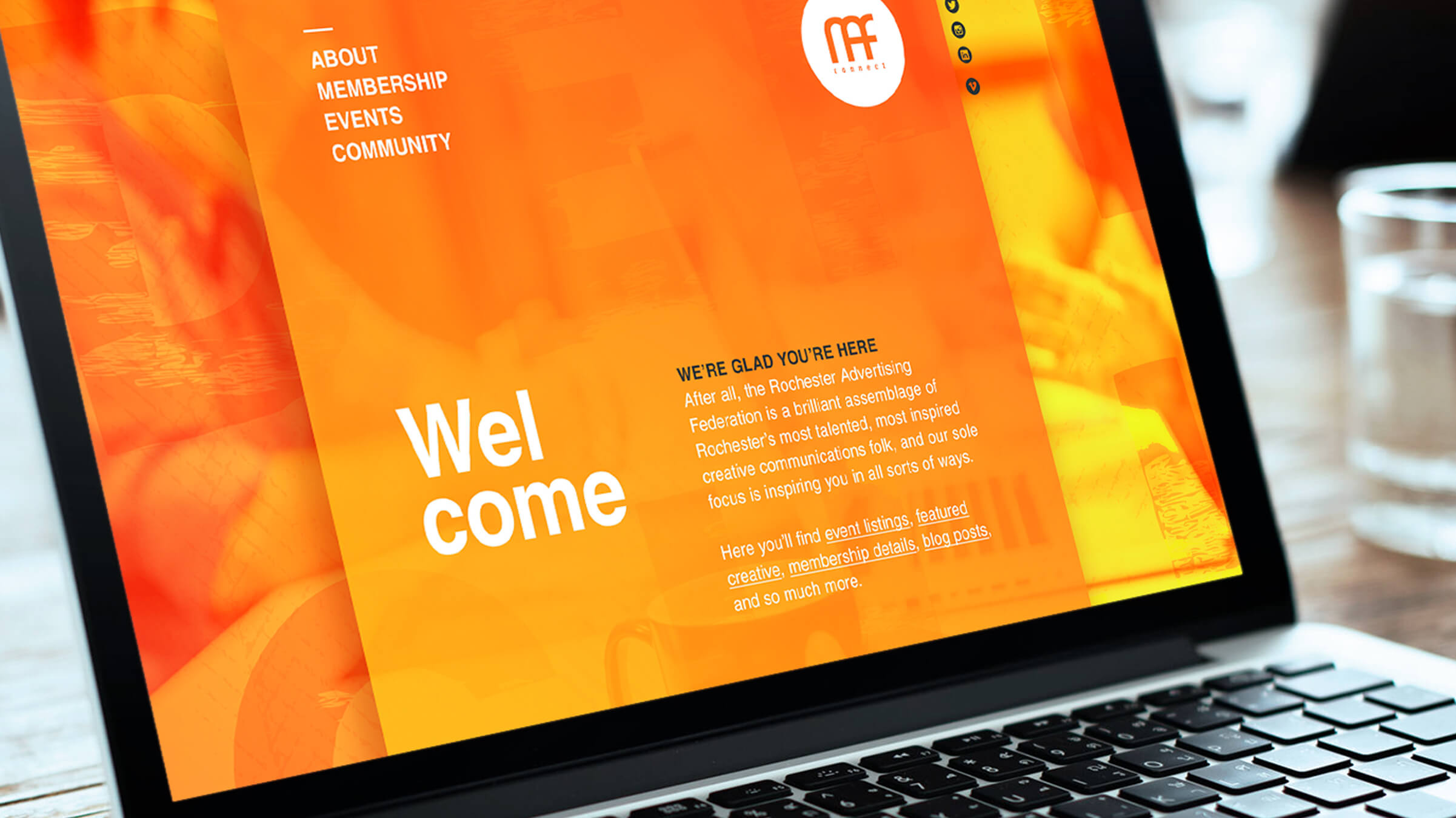
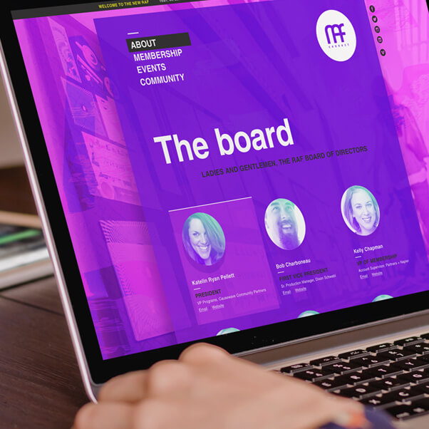
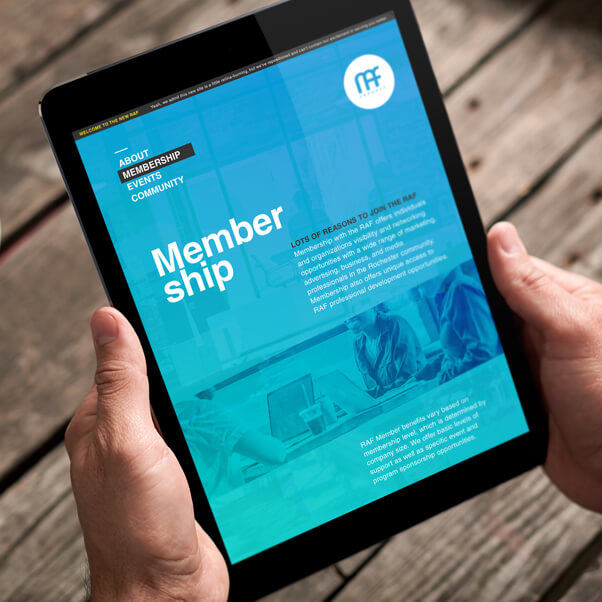
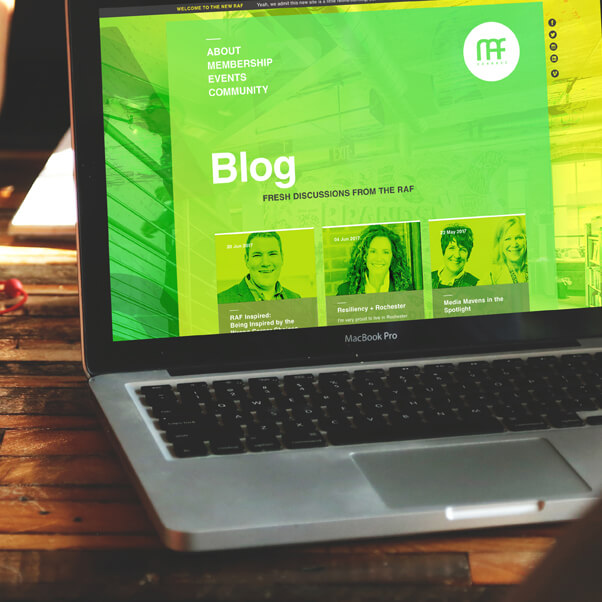
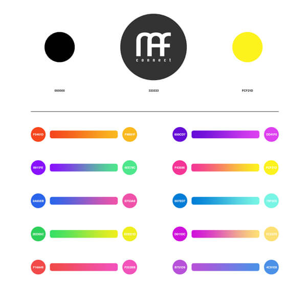
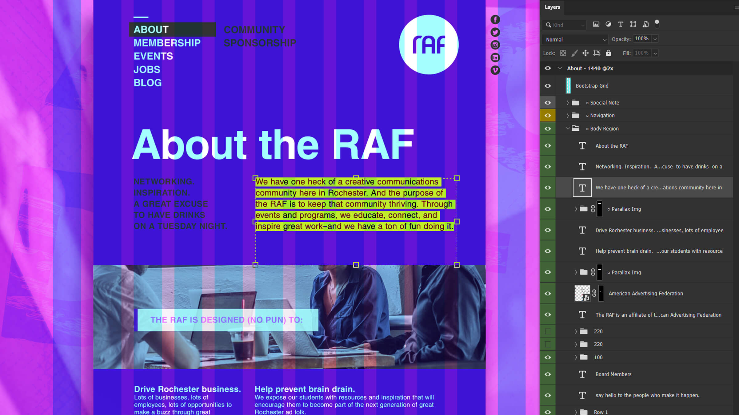
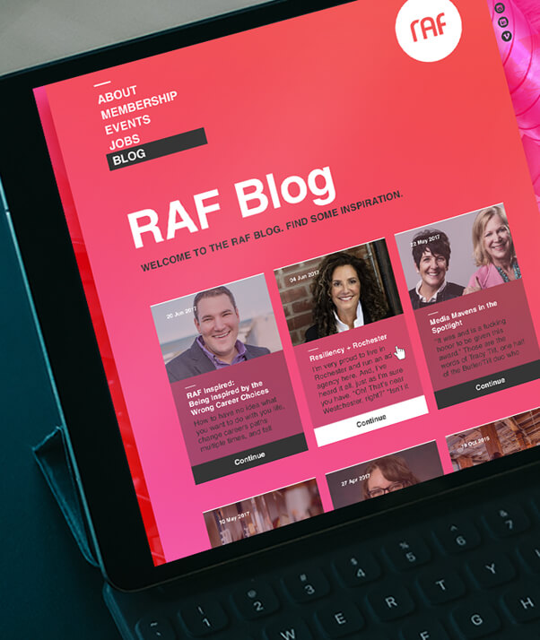
First things first: establish an agreed-upon visual library of assets to help propel the new vibe and energy of the club towards the community. The aesthetics were intentionally bold to help indicate a strong commitment in becoming more inclusive and approachable. We shook things up in a fun and passionate way.
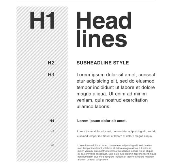
Vibrant gradient library and new brand typeset in Helvetica as a nod to academic roots.
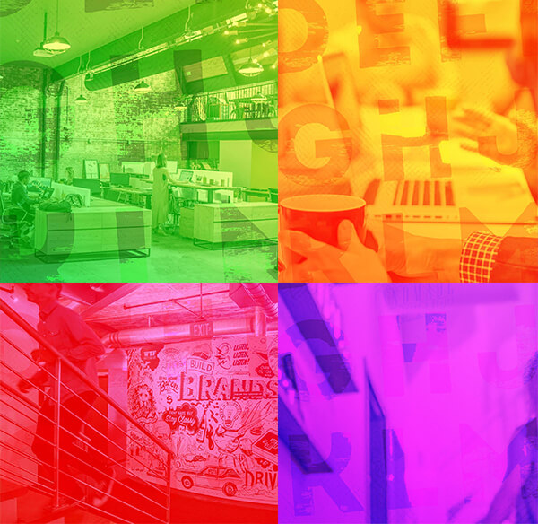
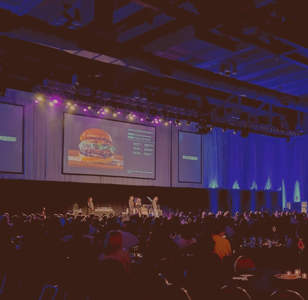
Toned new photo library in both vibrant and muted stylings.
Worked closely with a writer to create concise (yet thorough where needed) content and designed the information architecture to allow for easy navigation and comprehension. It was important to keep the visual/verbal tones consistently approachable and conversational—a balancing act for sure.
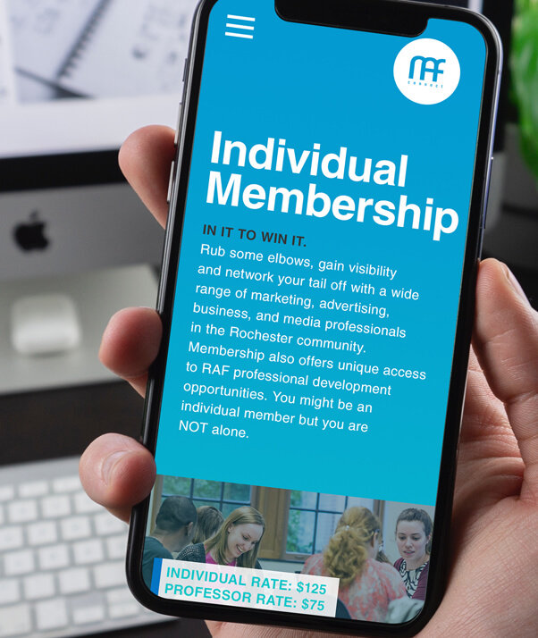
Membership
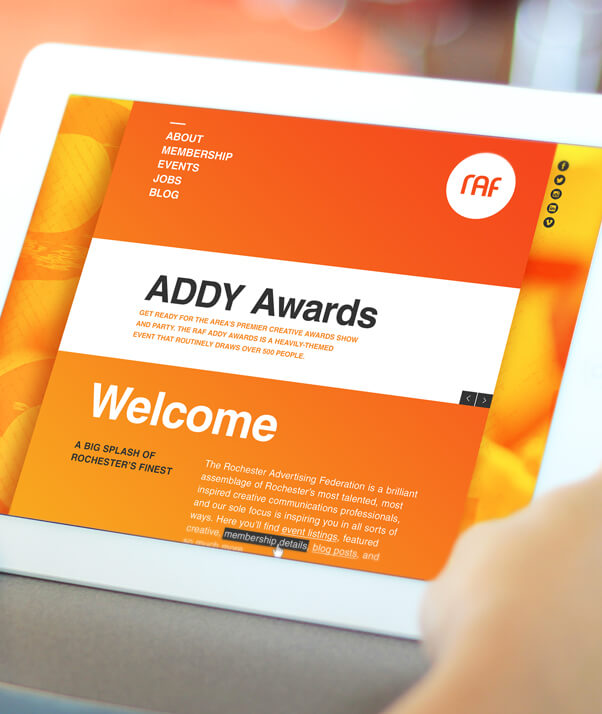
Home
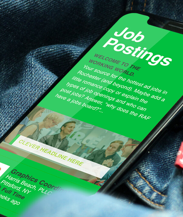
Jobs
Blog