Agency Rebrand
With a partner nearing retirement, I spearheaded a rename of the longest-running full-service agency in Rochester from MartinoFlynn to Flynn and drove a complete rebrand. The previous brand expression was conservative and clinical. The goal here was to inject new energy into all of our touchpoints and lean into the cornerstone of data and daring.
Core Brand Elements
Create an expressive, flexible identity + design system.
Coming off of the MartinoFlynn aesthetic that used thin elements with muted blues and grays, the rebirth of Flynn required a bold simplicity and undeniable visual confidence. We wanted the brand to push us forward, but not lose sight of the friendly, family-run shop.
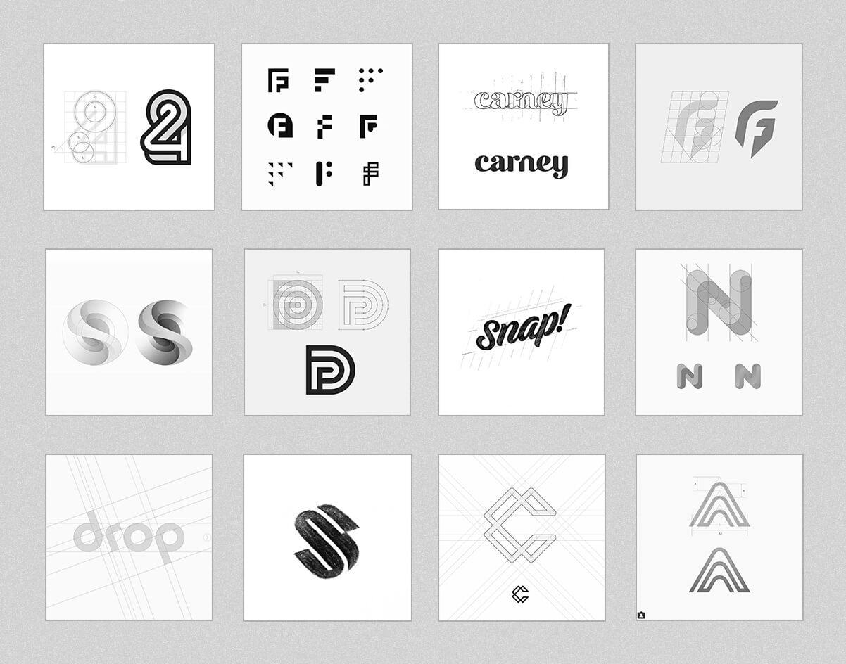
Design inspiration first
Initial exploration of forms and shapes that could spark a directional visual tone for Flynn.
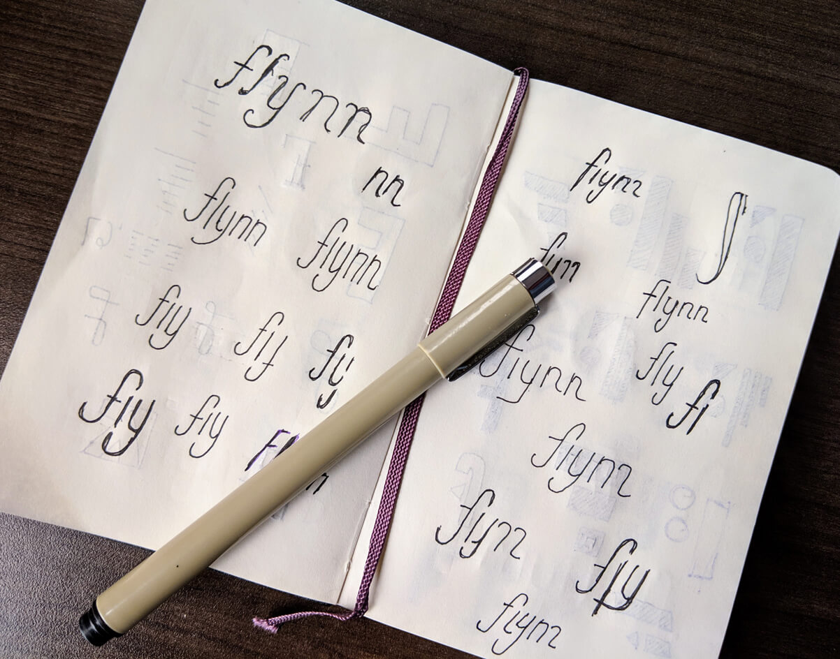
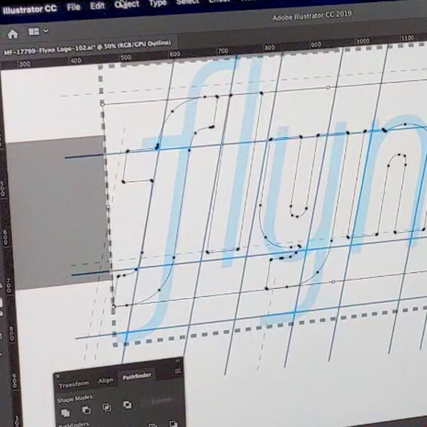
Pen to paper
Sketches of early ideation: simple, bespoke letterform arrangements with personality, confidence, and timelessness.
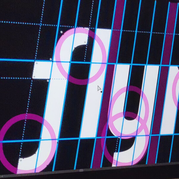
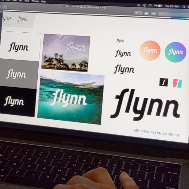
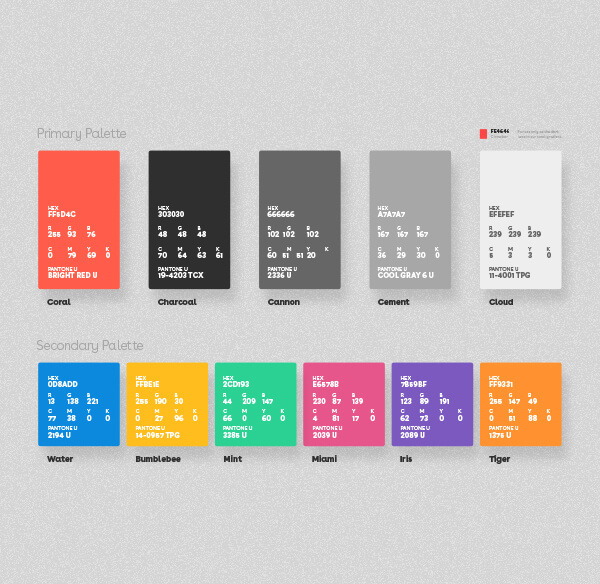
Type + color palette
After a lot of exploration, Buenos and coral reign.
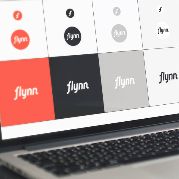
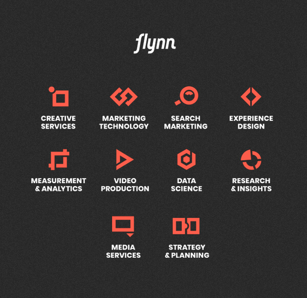
Icon system + video slates
Building out brand workhorse elements.
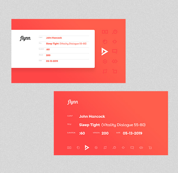
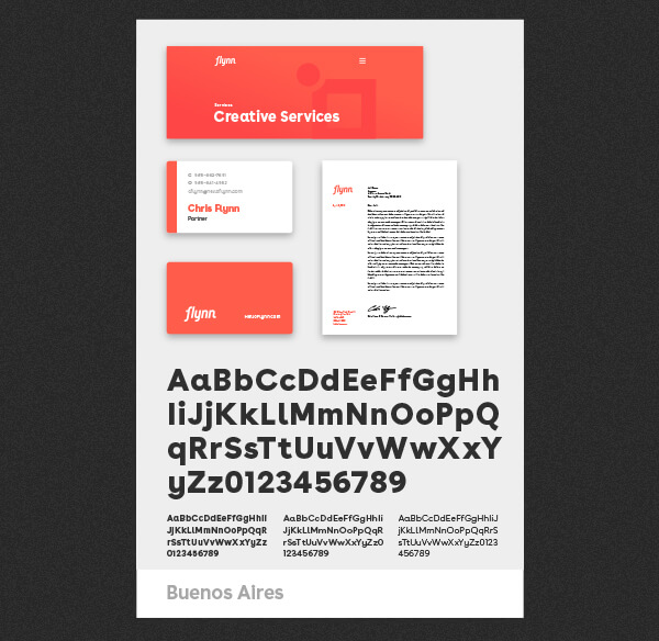
Brand Extension
Testing + putting it all together.
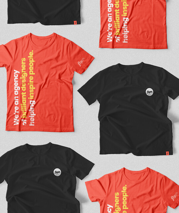
Branded Swag
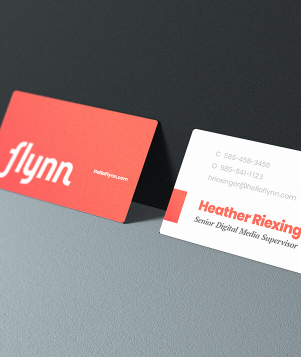
Deluxe Cards
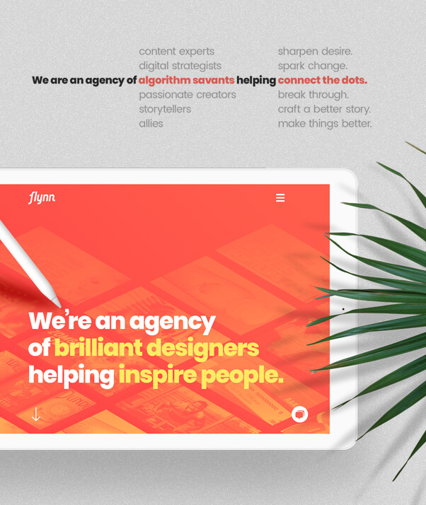
Homepage Exploration

Sell Sheets
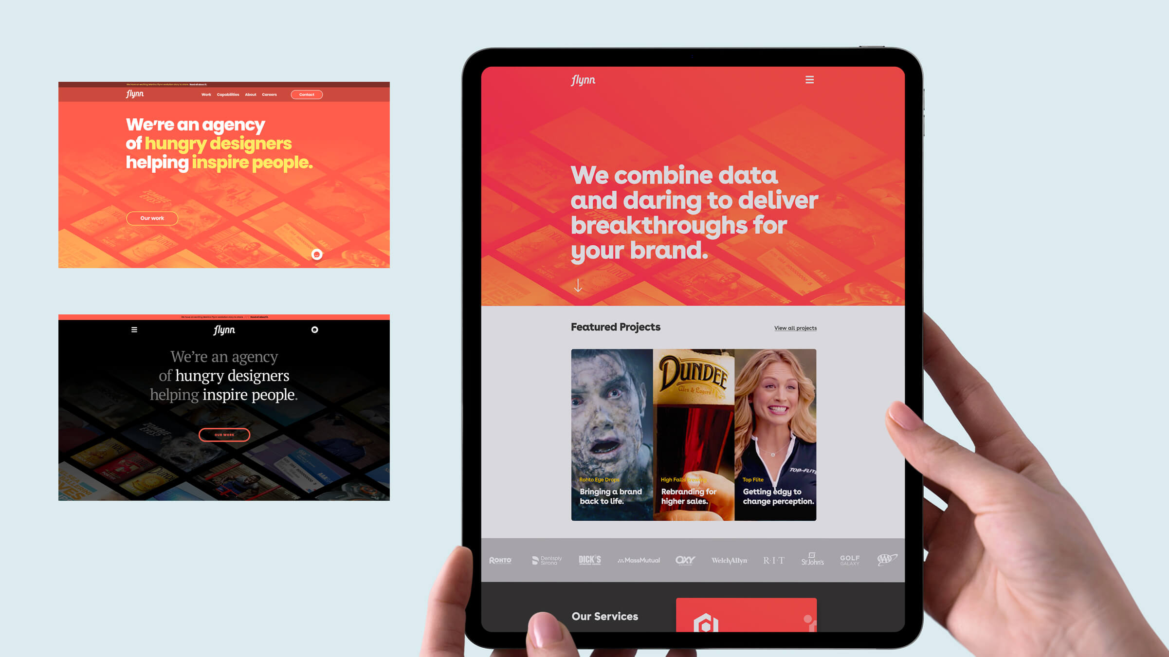
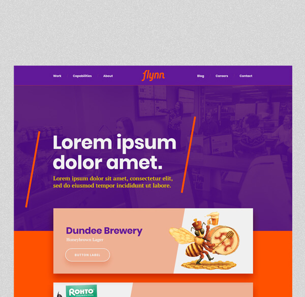
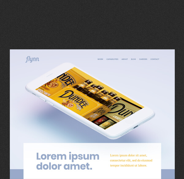
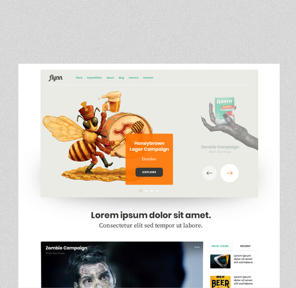
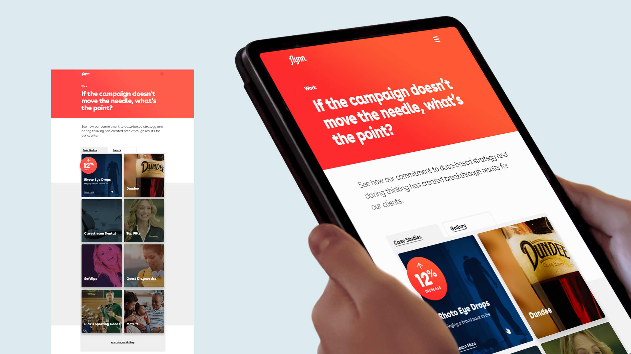
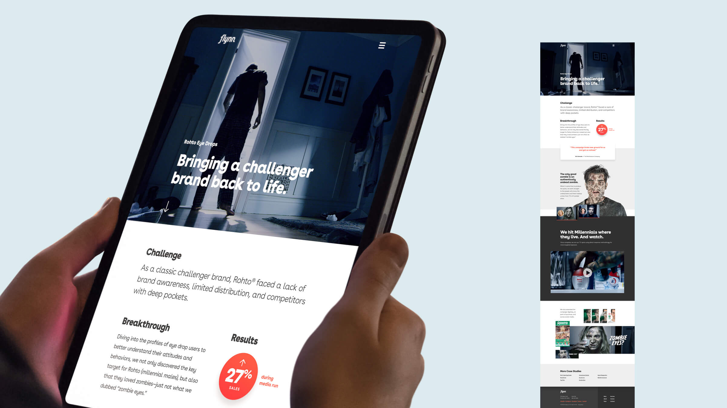
Website Design
Leading off with our strongest work + coral tones.
As Flynn's most powerful sales tool and complex brand touchpoint, there was a lot to consider in designing our new website. For certain, it needed to be aggressive, passionate, and confident, yet conversational—an honest reflection of the people behind the brand.
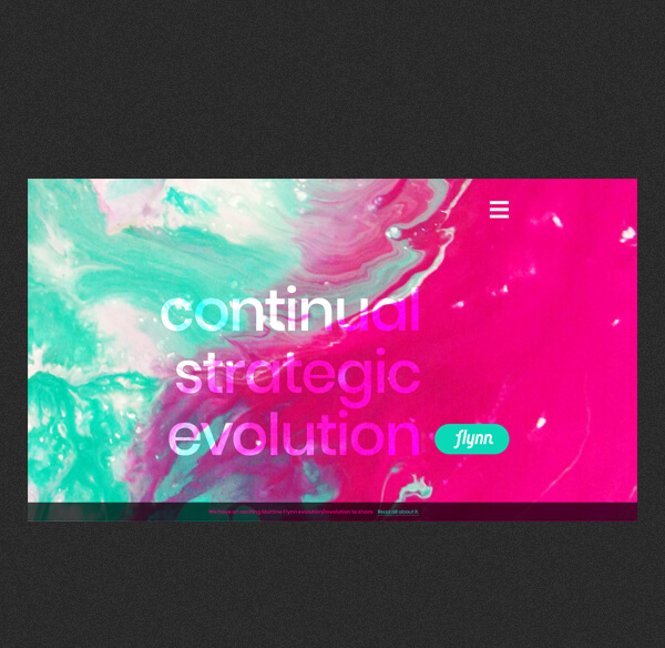
Initial ideations
An exploration of traditional and non-traditional.
Early design comps
Leading the vibe with work samples.
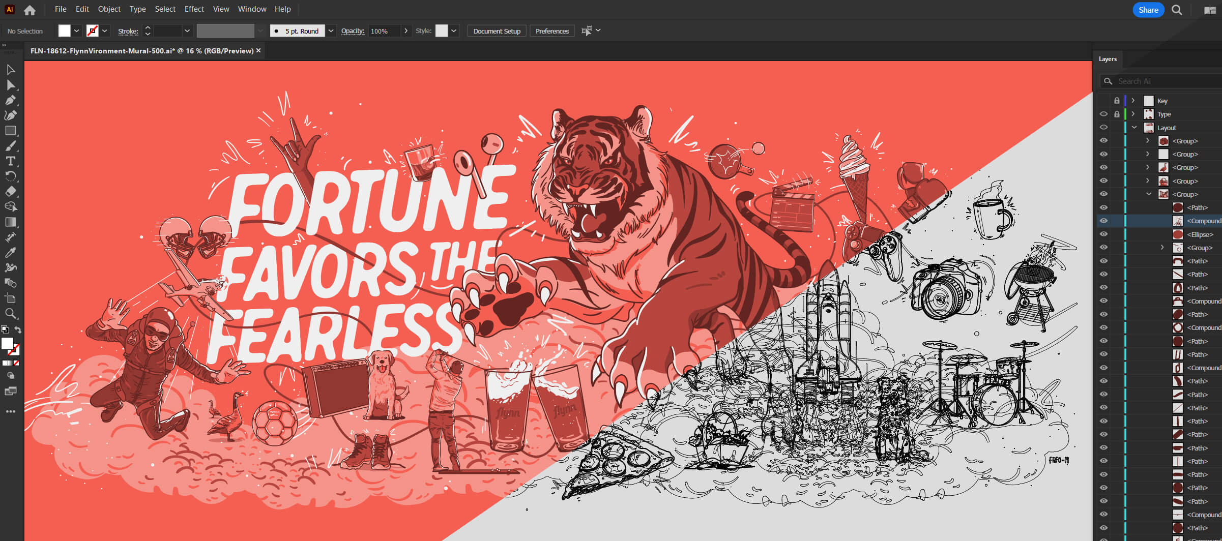
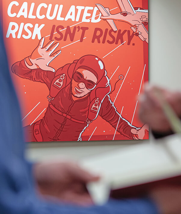
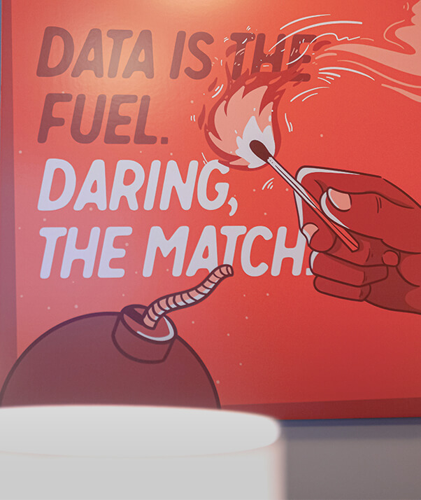
Environments + Brand Extensions
Push creative lines and own our visual character(s).
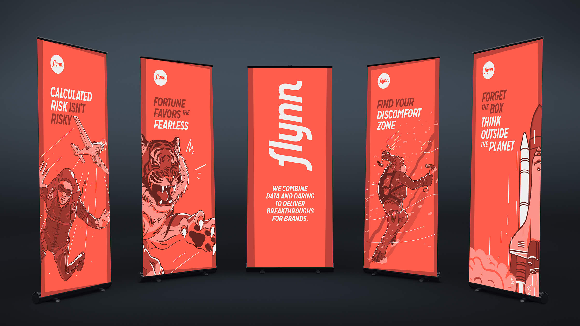
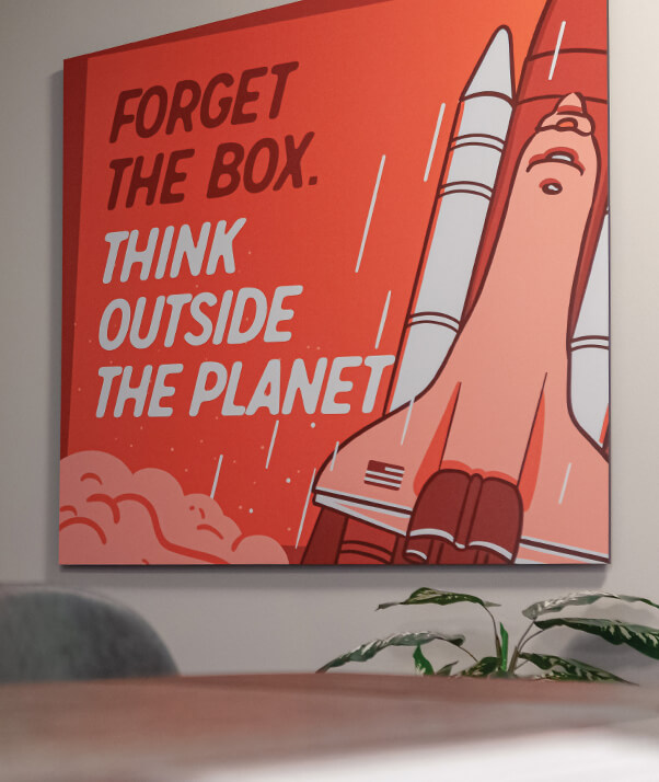
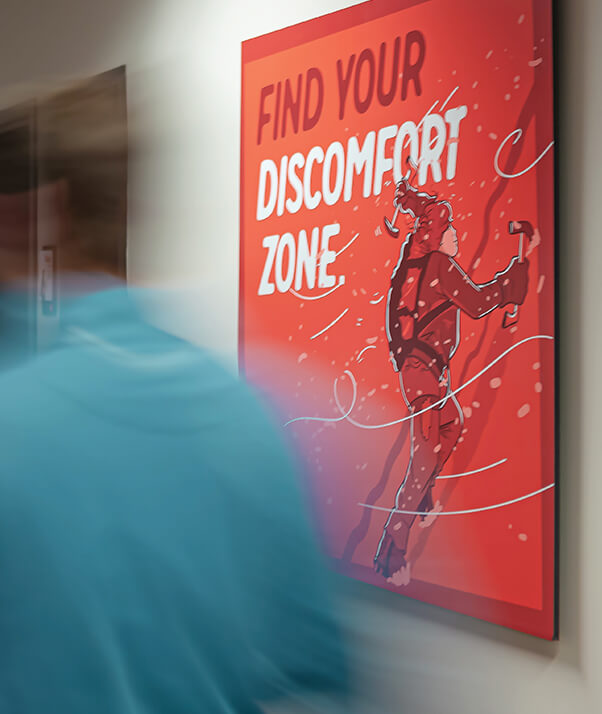
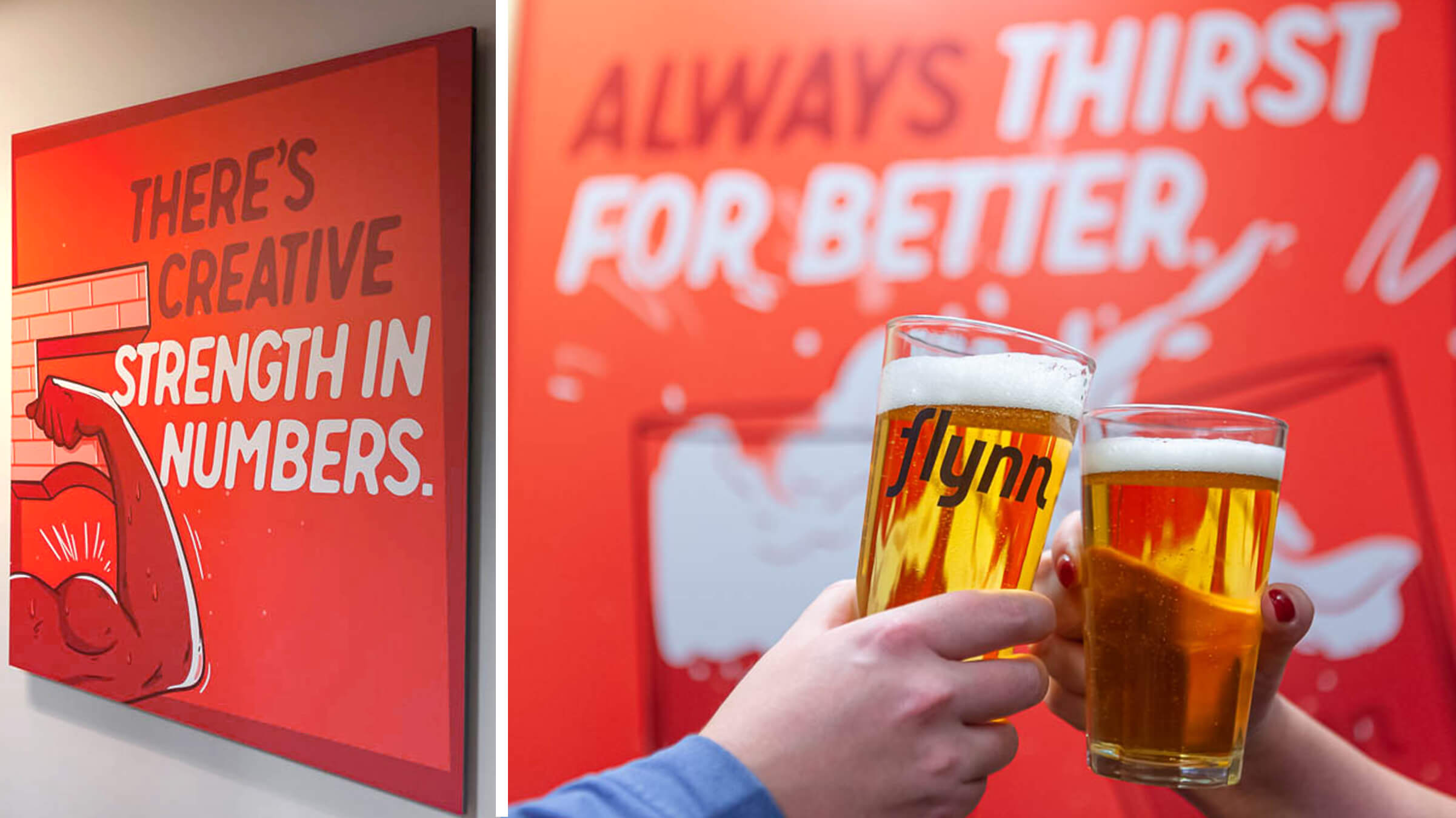
The Rochester office was getting a total makeover and a major component would be custom artwork that pushed the brand forward. We commissioned an illustrator and developed an art style of vector characters and elements for us to design a massive mural, bold wall hangings, and assets for marketing materials.
4x4 Gator Boards
Bringing the new space to life.
Client + Agency
- Client:
- MartinoFlynn
- Agency:
- Flynn
Assignment
- Brand Positioning
- Visual Brand ID
- Marketing Collateral
- Website Design
- Environmental Design
My Role
- Creative Director
- Designer
- Strategist
- Brand Ambassador
Our Team
- Matt D'Angelo, Creative
- Pete VonDerLinn, Strategy
- Evan Thorpe, Ideation
- Rich Kenyon, Developer
- Rafael Ferrao, Illustrator
- Brad Garratt, Copywriter